Power BI untuk Pendidik: Visualize Data dengan Mudah
Belajar menggunakan Microsoft Power BI untuk transform school data menjadi visual dashboards yang powerful untuk inform decision-making.
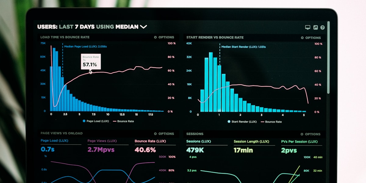
Data everywhere dalam sekolah kita - attendance, grades, behavior, demographics. Tetapi data dalam spreadsheet susah untuk make sense of. Power BI transform numbers into insights yang actionable.
Kenapa Power BI untuk Pendidik?
Traditional Approach: - Data dalam multiple Excel files - Manual calculations - Static reports - Susah untuk spot trends - Time-consuming updates
Power BI Approach: - Centralized data visualization - Interactive dashboards - Real-time updates - Pattern recognition easy - Shareable insights
Best part: Power BI Desktop adalah FREE untuk individual use!
Apa Yang Boleh Anda Buat?
1. Student Achievement Dashboard
- Visualize:
- Class average trends over time
- Subject performance comparisons
- Individual student progress
- Grade distribution
- Achievement gaps
- Use cases:
- Parent-teacher conferences
- Departmental reviews
- Intervention planning
- Principal reports
2. Attendance Analytics
- Track:
- Daily attendance patterns
- Chronic absenteeism identification
- Attendance by day/month
- Grade-level comparisons
- Impact on academic performance
- Benefits:
- Early intervention for at-risk students
- Resource allocation decisions
- Communication with parents
3. Behavior Tracking
- Monitor:
- Incident frequency and types
- Patterns by time/location
- Student-specific trends
- Intervention effectiveness
- Insights:
- Where/when most incidents occur
- Which strategies working
- Students needing support
4. Resource Utilization
- Analyze:
- Library book checkouts
- Computer lab usage
- Equipment reservations
- Facility utilization
- Decision-making:
- Budget priorities
- Staffing needs
- Schedule optimization
Getting Started: Your First Dashboard
Step 1: Install Power BI Desktop
- Go to Microsoft website
- Download Power BI Desktop (FREE)
- Install pada computer
- No subscription needed untuk basic use
Step 2: Prepare Your Data
- Best practices:
- Data dalam Excel atau Google Sheets
- Column headers dalam first row
- Consistent data types dalam columns
- No merged cells
- Remove unnecessary formatting
Example dataset structure:`
Student_ID | Name | Grade | Subject | Score | Date
001 | Ahmad | 5 | Math | 85 | 2025-01-15
002 | Sarah | 5 | Math | 92 | 2025-01-15`
Step 3: Import Data
- Open Power BI Desktop
- Click "Get Data"
- Select source (Excel, CSV, Google Sheets)
- Choose your file
- Select tables/sheets to import
- Click "Load"
Step 4: Create Your First Visual
Simple bar chart example:
- Click blank canvas
- Select "Clustered Bar Chart" dari visualizations
- Drag "Subject" to Axis
- Drag "Score" to Values (akan auto-calculate average)
- Boom! Your first visual!
Step 5: Add Filters (Slicers)
Make dashboard interactive:
- Add "Slicer" visualization
- Add "Grade" field
- Now users boleh filter entire dashboard by grade level
5 Essential Visualizations untuk Teachers
1. Line Chart: Progress Over Time
- Use for:
- Student improvement tracking
- Class average trends
- Attendance patterns
- Setup:
- X-axis: Date
- Y-axis: Score/Percentage
- Legend: Subject atau Student
2. Stacked Bar Chart: Comparative Analysis
- Use for:
- Multi-subject performance
- Grade-level comparisons
- Before/after intervention
3. Gauge: Goal Tracking
- Use for:
- Percentage to target
- Attendance rates
- Proficiency levels
Visual shows: Current value vs target dengan color coding
4. Card: Key Metrics
- Display:
- Class average
- Total students
- Attendance percentage
- Passing rate
Perfect for: At-a-glance numbers
5. Matrix/Table: Detailed Breakdown
- Use for:
- Individual student data
- Detailed comparisons
- Exportable data
Real-World Example: Math Department Dashboard
Scenario: SMK Bukit Indah Math Department wants to monitor student performance across 5 classes.
- Data sources:
- Monthly test scores (Excel)
- Attendance data (Excel)
- Demographic info (School system)
Dashboard includes:
- Top row:
- Cards showing: Total students, Average score, Pass rate
- Gauge showing: % towards department target
- Middle section:
- Line chart: Average scores per month untuk each class
- Stacked bar: Performance by topic (Algebra, Geometry, etc.)
- Scatter plot: Attendance vs Achievement correlation
- Bottom section:
- Matrix: Detailed student list dengan scores
- Slicers: Filter by Class, Month, Proficiency level
- Impact:
- Teachers immediately see struggling topics
- Identify students needing intervention
- Track intervention effectiveness
- Share insights dalam department meetings
Time saved: 5 hours per month dari manual reporting!
Advanced Features (When Ready)
1. Calculated Columns & Measures
Create custom calculations:
Example - Grade Category:`DAX
Grade Category =
IF([Score] >= 80, "A",
IF([Score] >= 60, "B",
IF([Score] >= 40, "C", "D")))`
2. Data Relationships
- Connect multiple tables:
- Student table
- Scores table
- Attendance table
- Linked by Student_ID
Benefits: Richer analysis across datasets
3. Drill-Through
- Click on visual to see detailed view:
- Click class average → see individual students
- Click subject → see topic breakdown
4. Bookmarks
- Save different views:
- Overview for principal
- Detailed for teachers
- Parent-friendly for conferences
Tips untuk Effective Dashboards
Design Principles:
- 1. Keep It Simple
- 5-7 visuals max per page
- Clear hierarchy
- Consistent colors
- 2. Tell a Story
- Most important info at top
- Logical flow
- Context for numbers
- 3. Make It Interactive
- Add slicers
- Enable drill-down
- Tooltips dengan extra info
- 4. Choose Right Visuals
- Trends: Line charts
- Comparisons: Bar charts
- Proportions: Pie charts
- Relationships: Scatter plots
Color Guidelines:
- Green: Good performance, on track
- Yellow/Orange: Needs attention
- Red: Urgent intervention needed
- Consistent across all visuals
Sharing Your Dashboard
Option 1: Power BI Desktop File - Save as .pbix file - Share dengan colleagues who have Power BI Desktop
Option 2: PDF Export - File → Export → PDF - Static snapshot untuk sharing - Good untuk printed reports
Option 3: Power BI Service (Cloud) - Upload to PowerBI.com - Interactive online dashboard - Requires Power BI Pro license ($9.99/month) - Recipients can interact tanpa license
Option 4: Publish to Web - Public sharing option - Get embed code - Share via link - **Caution:** Data becomes public!
Common Challenges & Solutions
Challenge 1: Data dari Berbeza Sources
- Solution: Power Query untuk combine data
- Import from multiple files
- Append atau merge tables
- Clean dan transform data
Challenge 2: Data Updates Frequently
- Solution:
- Keep original files dalam consistent location
- "Refresh" button updates dashboard
- Set up automatic refresh (Power BI Service)
Challenge 3: Slow Performance
- Solution:
- Reduce data volume (filter unnecessary rows)
- Optimize data model
- Use aggregated data untuk large datasets
Challenge 4: Privacy Concerns
- Solution:
- Anonymize sensitive data
- Password-protect files
- Limit sharing access
- Follow PDPA guidelines
Learning Resources
Free Tutorials: - **Microsoft Learn**: Power BI guided paths - **YouTube**: "Guy in a Cube" channel - **Power BI Community**: Forums dan examples
Practice Datasets: - Generate sample school data - Use publicly available education datasets - Ministry of Education open data
Templates: - Search "Power BI education templates" - Microsoft Template Gallery - Teacher-shared templates dalam communities
30-Day Learning Plan
- Week 1: Basics
- Install Power BI Desktop
- Complete Microsoft's "Getting Started" tutorial
- Import sample dataset
- Create 3 basic visualizations
- Week 2: Your First Real Dashboard
- Gather actual school data (start small!)
- Import dan clean data
- Build 5-visual dashboard
- Share with colleague for feedback
- Week 3: Interactivity
- Add slicers
- Create drill-through
- Learn basic DAX formulas
- Improve dashboard based on feedback
- Week 4: Polish & Share
- Apply design principles
- Add titles dan descriptions
- Test usability
- Present to team/department
Success Story: SJK(C) Pei Ming
- Before Power BI:
- Monthly reports took 8+ hours to compile
- Data dalam 10+ different Excel files
- Hard to spot struggling students early
- Limited data-driven decisions
- After Power BI:
- Real-time dashboard updated weekly
- 2 hours untuk updates (from 8+)
- Early intervention increased by 40%
- Teachers request more data insights
Teacher feedback: "For first time, I can actually SEE patterns dalam student performance. Game changer untuk my teaching!" - Teacher Lim
Kesimpulan
Power BI transforms how we understand dan use data dalam pendidikan. Bukan just for data scientists - it's for educators yang ingin make informed decisions untuk students.
- Start small:
- Download Power BI Desktop today
- Pick ONE dataset to visualize
- Build simple dashboard
- Share dan iterate
Data tells stories. Power BI helps you tell them clearly.
Your turn: What data would be most valuable untuk you to visualize? Start there!
---
Questions? Drop dalam comments atau email. Happy to help you get started dengan your data visualization journey!
Sumber Berguna untuk Guru
Buku & Rujukan: Beli buku pendidikan & AI di Kinokuniya Malaysia. | Amazon
Kursus Online: Tingkatkan kemahiran anda — kursus AI & teknologi di Udemy dari RM39.
Bina Website: Bina laman web & portfolio digital anda sendiri — hosting dari RM5/bulan di Hostinger.
Beli di Shopee: Beli alat tulis, gadget & bahan mengajar di Shopee dengan harga terbaik.
Duit Sampingan: Nak buat duit sampingan? Daftar Involve Asia — platform affiliate marketing #1 di Asia Tenggara.
* Artikel ini mengandungi pautan affiliate. Kami mungkin menerima komisen kecil jika anda membuat pembelian.
Tentang Ts. Ashraf bin Naim
Pendidik berpengalaman yang bersemangat tentang AI, EdTech, dan transformasi digital dalam pendidikan. Berkongsi insights dan pengalaman praktikal untuk membantu pendidik lain.